主题定制
从 5.30.0 版本开始,IMKit 支持主题定制功能,提供传统主题和欢快主题两种内置主题,同时支持自定义主题。
功能概述
IMKit 的主题定制功能提供了灵活的主题配置能力,包括:
- 内置主题:传统主题(Traditional)和欢快主题(Lively)
- 自定义主题:支持基于内置主题进行颜色和图片的自定义
- 深色模式:iOS 13+ 自动适配系统深色模式
- 动态切换:运行时无缝切换主题,无需重启应用
效果预览
| 传统主题-浅色 | 传统主题-深色 | 欢快主题-浅色 | 欢快主题-深色 |
|---|---|---|---|
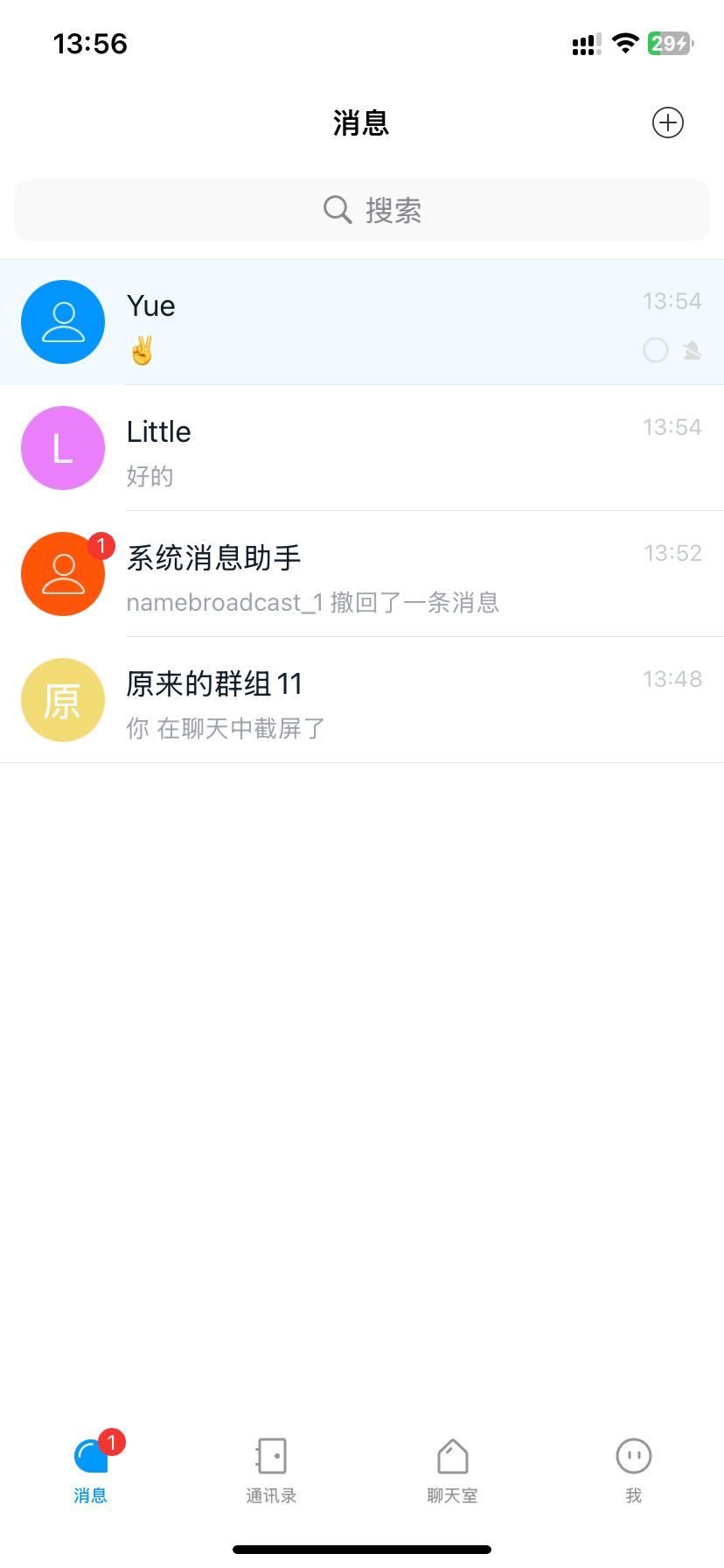 | 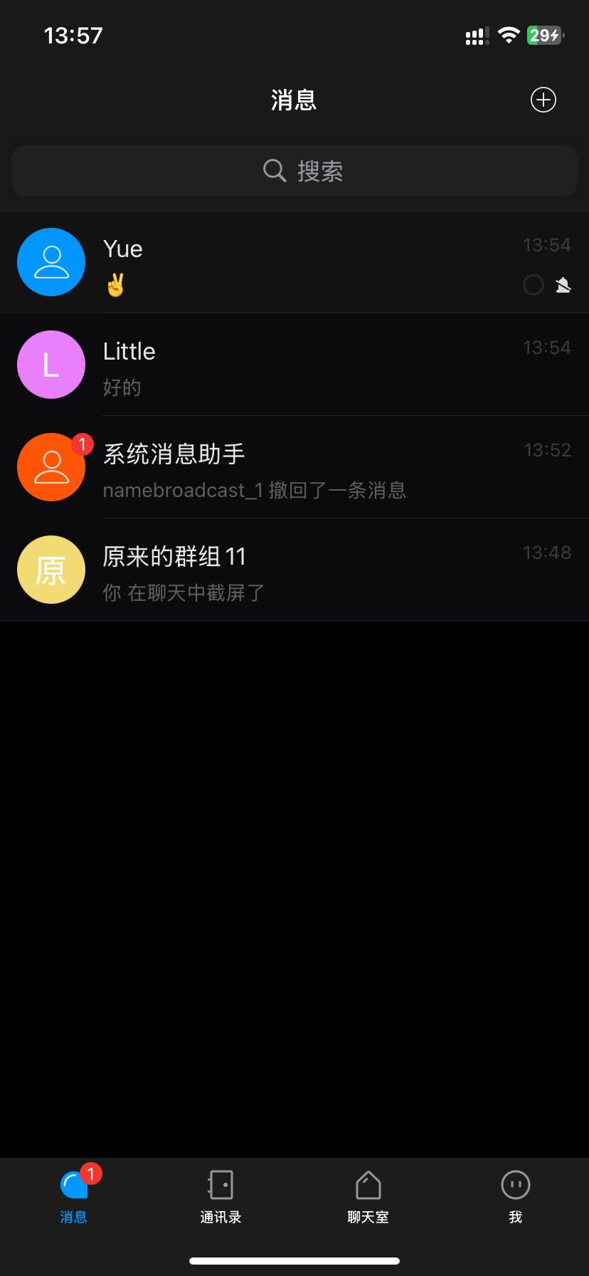 | 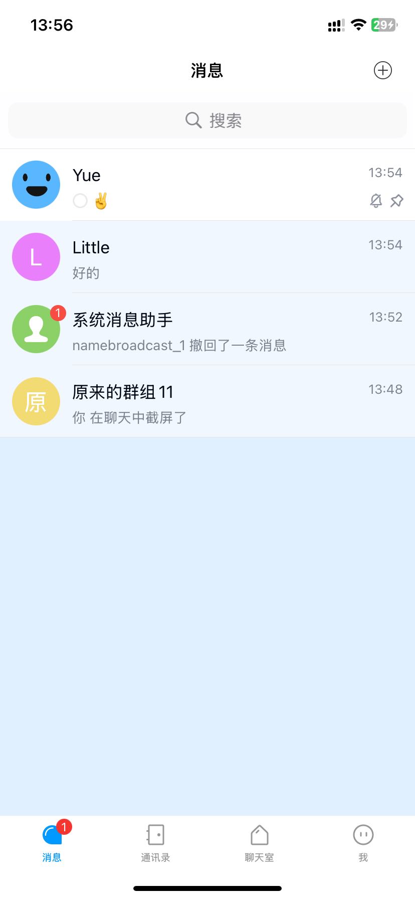 | 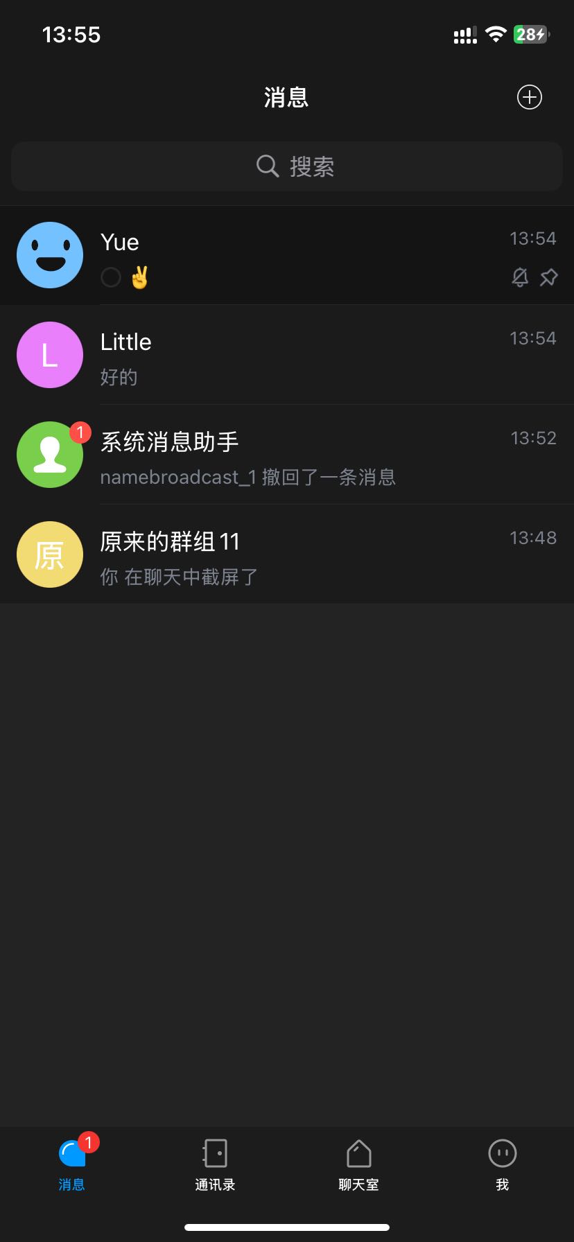 |
主题资源
在 RongIMKit.framework 组件文件夹下可以看到所支持的内置主题资源 RongCloudLively.bundle 和 RongCloud.bundle。RongCloudLively.bundle 为欢快主题资源包,RongCloud.bundle 为传统主题资源包。
选中 RongCloudLively.bundle并右键选择 Show Package Contents 即可看到内置的两套主题资源,文件夹名称即为主题类别。
我们以 “欢快主题” 为例,light 文件夹下包含 theme.plist 文件和 resources 资源文件夹。
theme.plist 文件存储了当前主题所使用的图片、颜色等要素的值,深色和浅色主题下的 theme.plist 文件中的 colors key 均相同;
resources 资源文件夹存储了当前主题所使用的资源,例如图片。
新增主题需要基于内置主题实现,用户需提供包含 theme.plist 文件和 resources 资源文件夹的 bundle,其中 theme.plist 的 key 按需添加,缺失的 key,SDK 会从内置主题浅色资源中获取对应资源替换。
快速开始
使用内置主题
IMKit SDK 默认使用传统主题,您可以通过以下方式切换主题:
#import <RongIMKit/RongIMKit.h>

// 切换到传统主题
[RCIMKitThemeManager changeInnerTheme:RCIMKitInnerThemesTypeTradition];

// 切换到欢快主题
[RCIMKitThemeManager changeInnerTheme:RCIMKitInnerThemesTypeLively];
主题系统架构
核心类说明
RCIMKitThemeManager
主题管理器,负责主题的切换和资源获取。
主要方法:
| 方法 | 说明 |
|---|---|
changeInnerTheme: | 切换内置主题 |
changeCustomTheme:baseOnTheme: | 应用自定义主题 |
currentInnerThemesType | 获取当前内置主题类型 |
dynamicColor:lightColor:darkColor: | 获取动态颜色 |
dynamicImage:defaultImageName: | 获取动态图片 |
addThemeDelegate: | 添加主题变更监听 |
removeThemeDelegate: | 移除主题变更监听 |
RCIMKitTheme
自定义主题类,用于加载和管理自定义主题资源。
主要属性:
| 属性 | 类型 | 说明 |
|---|---|---|
name | NSString | 主题名称 |
colors | NSDictionary | 颜色配置字典 |
images | NSDictionary | 图片配置字典 |
resourcePath | NSString | 资源文件夹路径 |
plistPath | NSString | 配置文件路径 |
RCIMKitInnerThemesType
内置主题类型枚举。
typedef NS_ENUM(NSInteger, RCIMKitInnerThemesType) {
    RCIMKitInnerThemesTypeTradition,  // 传统主题
    RCIMKitInnerThemesTypeLively      // 欢快主题
};
主题切换
使用内置主题
IMKit 提供两种内置主题:传统主题(Traditional)和欢快主题(Lively)。
切换到传统主题
#import <RongIMKit/RongIMKit.h>

// 切换到传统主题
[RCIMKitThemeManager changeInnerTheme:RCIMKitInnerThemesTypeTradition];
切换到欢快主题
// 切换到欢快主题
[RCIMKitThemeManager changeInnerTheme:RCIMKitInnerThemesTypeLively];
获取当前主题
// 获取当前内置主题类型
RCIMKitInnerThemesType currentType = [RCIMKitThemeManager currentInnerThemesType];
if (currentType == RCIMKitInnerThemesTypeTradition) {
    NSLog(@"当前使用传统主题");
} else {
    NSLog(@"当前使用欢快主题");
}
主题变更监听
实现 RCIMKitThemeDelegate 协议来监听主题变更:
#import <RongIMKit/RongIMKit.h>

@interface YourViewController () <RCIMKitThemeDelegate>
@end

@implementation YourViewController

- (void)viewDidLoad {
    [super viewDidLoad];

    // 添加主题变更监听
    [RCIMKitThemeManager addThemeDelegate:self];
}

- (void)dealloc {
    // 移除主题变更监听
    [RCIMKitThemeManager removeThemeDelegate:self];
}

#pragma mark - RCIMKitThemeDelegate

/// 主题变更回调
/// @param customTheme 自定义主题对象(未设置时为 nil)
/// @param type 内置主题类型
- (void)themeDidChanged:(RCIMKitTheme *)customTheme
        baseOnTheme:(RCIMKitInnerThemesType)type {
    NSLog(@"主题已变更:%@", type == RCIMKitInnerThemesTypeTradition ? @"传统主题" : @"欢快主题");

    // 更新自定义 UI
    [self updateUIForNewTheme];
}

- (void)updateUIForNewTheme {
    // 刷新界面
    [self.tableView reloadData];

    // 更新导航栏
    [self updateNavigationBar];

    // 更新其他 UI 组件
    // ...
}

@end
深色模式支持
IMKit 会自动适配 iOS 13+ 的系统深色模式,无需额外配置。
- iOS 13+:完整支持深色模式
- iOS 13 以下:仅支持浅色模式
自定义主题
创建自定义主题
步骤 1:准备主题资源
创建主题文件夹,包含配置文件和资源文件:
MyCustomTheme/
├── theme.plist          # 主题配置文件
└── resources/           # 资源文件夹
    ├── icon_add@2x.png
    ├── icon_add@3x.png
    ├── icon_emoji@2x.png
    ├── icon_emoji@3x.png
    └── ...              # 其他图片资源
步骤 2:配置 theme.plist
创建 theme.plist 文件,配置颜色和图片映射:
<?xml version="1.0" encoding="UTF-8"?>
<!DOCTYPE plist PUBLIC "-//Apple//DTD PLIST 1.0//EN" "http://www.apple.com/DTDs/PropertyList-1.0.dtd">
<plist version="1.0">
<dict>
    <!-- 主题名称 -->
    <key>name</key>
    <string>MyCustomTheme</string>

    <!-- 颜色配置 -->
    <key>colors</key>
    <dict>
        <!-- 主色调 -->
        <key>primary_color</key>
        <string>#FF6B00</string>

        <!-- 一级标题颜色 -->
        <key>title_of_first_level_color</key>
        <string>#1A1A1A</string>

        <!-- 二级标题颜色 -->
        <key>title_of_secondary_level_color</key>
        <string>#666666</string>

        <!-- 背景颜色 -->
        <key>common_background_color</key>
        <string>#FFFFFF</string>

        <!-- 更多颜色配置... -->
    </dict>

    <!-- 图片配置 -->
    <key>images</key>
    <dict>
        <!-- 输入栏添加按钮 -->
        <key>conversation_input_bar_add_img</key>
        <string>icon_add.png</string>

        <!-- 输入栏表情按钮 -->
        <key>conversation_input_bar_emoji_img</key>
        <string>icon_emoji.png</string>

        <!-- 更多图片配置... -->
    </dict>
</dict>
</plist>
步骤 3:将主题资源添加到项目
- 将主题文件夹拖入 Xcode 项目
- 选择 "Create folder references"(创建文件夹引用)
- 确保资源文件被添加到 Target 中
步骤 4:加载并应用自定义主题
#import <RongIMKit/RongIMKit.h>

// 获取主题文件夹路径
NSString *themePath = [[NSBundle mainBundle] pathForResource:@"MyCustomTheme" ofType:nil];

// 创建自定义主题对象
RCIMKitTheme *customTheme = [[RCIMKitTheme alloc] initWithThemePath:themePath];

// 应用自定义主题(基于传统主题)
[RCIMKitThemeManager changeCustomTheme:customTheme
                        baseOnTheme:RCIMKitInnerThemesTypeTradition];

// 或基于欢快主题
// [RCIMKitThemeManager changeCustomTheme:customTheme
//                         baseOnTheme:RCIMKitInnerThemesTypeLively];
自定义主题的优先级
自定义主题的资源加载遵循以下优先级:
- 自定义主题配置:优先使用
theme.plist中配置的颜色和图片 - 内置主题配置:如果自定义主题中未配置,则使用内置主题的资源
- 颜色默认值:如果无法获取到定义的有效颜色, 则会返回透明色
示例:
// 假设自定义主题只配置了 primary_color
// 其他颜色会使用基础主题(传统或欢快)的配置

RCIMKitTheme *customTheme = [[RCIMKitTheme alloc] initWithThemePath:themePath];
[RCIMKitThemeManager changeCustomTheme:customTheme
                        baseOnTheme:RCIMKitInnerThemesTypeTradition];

// primary_color 使用自定义主题的配置
// 其他颜色使用传统主题的配置
RongCloudLively.bundle 说明
目录结构
RongCloudLively.bundle 是欢快主题的资源包,位于 RongIMKit/Resource/ 目录下,其结构如下:
RongCloudLively.bundle/
├── light/                      # 浅色主题
│   ├── theme.plist            # 浅色主题配置文件
│   └── resources/             # 浅色主题图片资源
│       ├── inputbar_add@2x.png
│       ├── inputbar_add@3x.png
│       ├── inputbar_emoji@2x.png
│       ├── inputbar_emoji@3x.png
│       └── ...                # 其他图片资源
└── dark/                       # 深色主题
    ├── theme.plist            # 深色主题配置文件
    └── resources/             # 深色主题图片资源
        ├── inputbar_add@2x.png
        ├── inputbar_add@3x.png
        ├── inputbar_emoji@2x.png
        ├── inputbar_emoji@3x.png
        └── ...                # 其他图片资源
theme.plist 配置文件
theme.plist 是主题的核心配置文件,包含颜色和图片的映射关系。
配置文件结构
<?xml version="1.0" encoding="UTF-8"?>
<!DOCTYPE plist PUBLIC "-//Apple//DTD PLIST 1.0//EN" "http://www.apple.com/DTDs/PropertyList-1.0.dtd">
<plist version="1.0">
<dict>
    <!-- 主题名称 -->
    <key>name</key>
    <string>light</string>

    <!-- 颜色配置 -->
    <key>colors</key>
    <dict>
        <key>primary_color</key>
        <string>#0047FF</string>

        <key>title_of_first_level_color</key>
        <string>#020814</string>

        <key>title_of_secondary_level_color</key>
        <string>#7C838E</string>

        <!-- 更多颜色配置 -->
    </dict>

    <!-- 图片配置 -->
    <key>images</key>
    <dict>
        <key>conversation_input_bar_add_img</key>
        <string>inputbar_add.png</string>

        <key>conversation_input_bar_emoji_img</key>
        <string>inputbar_emoji.png</string>

        <!-- 更多图片配置 -->
    </dict>
</dict>
</plist>
字段说明
name(主题名称)
- 类型:String
- 必填:是
- 说明:主题的唯一标识符
- 示例:
light、dark、MyCustomTheme
colors(颜色配置)
- 类型:Dictionary
- 必填:否
- 说明:颜色键值对映射表
- 键:颜色标识符(如
primary_color) - 值:十六进制颜色值
颜色值格式:
#RRGGBB:6 位十六进制,不带透明度(如#0047FF)#RRGGBBAA:8 位十六进制,带透明度(如#0047FF80)
images(图片配置)
- 类型:Dictionary
- 必填:否
- 说明:图片键值对映射表
- 键:图片标识符(如
conversation_input_bar_add_img) - 值:图片文件名(相对于
resources/目录)
图片文件命名规范:
- 支持
@2x和@3x后缀 - 示例:
icon.png、icon@2x.png、icon@3x.png
自定义 Bundle
您可以参考 RongCloudLively.bundle 的结构创建自己的主题 Bundle:
- 创建 Bundle 文件夹
- 添加
theme.plist配置文件 - 添加
resources/文件夹和图片资源 - 将 Bundle 添加到项目中
颜色配置说明
常用颜色键
以下是 IMKit 中常用的颜色键及其用途:
主色调
| 颜色键 | 说明 | 使用场景 |
|---|---|---|
primary_color | 主色调 | 按钮、链接、强调文本 |
secondary_color | 辅助色 | 次要按钮、辅助信息 |
文本颜色
| 颜色键 | 说明 | 使用场景 |
|---|---|---|
text_primary_color | 主要文本颜色 | 标题、正文 |
text_secondary_color | 次要文本颜色 | 副标题、说明文字 |
text_tertiary_color | 三级文本颜色 | 提示文字、时间戳 |
title_of_first_level_color | 一级标题颜色 | 页面标题 |
title_of_secondary_level_color | 二级标题颜色 | 分组标题 |
背景颜色
| 颜色键 | 说明 | 使用场景 |
|---|---|---|
common_background_color | 通用背景颜色 | 页面背景 |
auxiliary_background_1_color | 辅助背景颜色 1 | 卡片背景 |
auxiliary_background_2_color | 辅助背景颜色 2 | 次级卡片背景 |
pop_layer_background_color | 弹出层背景颜色 | 弹窗、菜单背景 |
分割线颜色
| 颜色键 | 说明 | 使用场景 |
|---|---|---|
line_background_color | 分割线颜色 | 列表分割线、边框 |
状态颜色
| 颜色键 | 说明 | 使用场景 |
|---|---|---|
disabled_color | 禁用状态颜色 | 禁用按钮、不可用文本 |
hint_color | 提示颜色 | 占位符、提示信息 |
control_title_white_color | 控件标题白色 | 按钮文字(深色背景) |
颜色值格式
支持的格式
-
6 位十六进制(RGB)
#RRGGBB
示例:#0047FF(蓝色) -
8 位十六进制(RGBA)
#RRGGBBAA
示例:#0047FF80(半透明蓝色)
透明度说明
透明度(Alpha)值范围:00(完全透明)到 FF(完全不透明)
常用透明度值:
FF:100% 不透明CC:80% 不透明99:60% 不透明66:40% 不透明33:20% 不透明00:完全透明
示例:
<key>text_primary_color</key>
<string>#000000</string>      <!-- 纯黑色 -->

<key>text_secondary_color</key>
<string>#00000099</string>    <!-- 60% 透明度的黑色 -->
关键页面说明
会话列表页面
会话列表页面是应用的主要入口,展示所有会话。
页面效果
可定制元素
颜色键
| 元素 | 颜色键 | 说明 |
|---|---|---|
| 页面背景 | common_background_color | 列表背景色 |
| 会话标题 | text_primary_color | 会话名称 |
| 最后消息 | text_secondary_color | 最后一条消息内容 |
| 时间戳 | text_tertiary_color | 消息时间 |
| 未读数气泡 | primary_color | 未读消息数背景 |
| 分割线 | line_background_color | 会话之间的分割线 |
图片键
| 元素 | 图片键 | 说明 |
|---|---|---|
| 默认头像 | conversation-list_cell_portrait_img | 单聊默认头像 |
| 群组头像 | conversation-list_cell_group_portrait_img | 群聊默认头像 |
| 置顶图标 | conversation-list_cell_pin_img | 置顶标识 |
| 免打扰图标 | conversation-list_cell_block_notification_img | 免打扰标识 |
代码示例
// 自定义会话列表颜色
UIColor *backgroundColor = [RCIMKitThemeManager dynamicColor:@"common_background_color"
                                                  lightColor:@"#FFFFFF"
                                                   darkColor:@"#000000"];
self.tableView.backgroundColor = backgroundColor;

// 自定义会话标题颜色
UIColor *titleColor = [RCIMKitThemeManager dynamicColor:@"text_primary_color"
                                             lightColor:@"#020814"
                                              darkColor:@"#FFFFFF"];
cell.titleLabel.textColor = titleColor;
会话页面
会话页面是用户进行聊天的核心界面。
页面效果
可定制元素
输入栏
颜色键:
| 元素 | 颜色键 | 说明 |
|---|---|---|
| 输入框背景 | auxiliary_background_1_color | 输入框背景色 |
| 输入框文字 | text_primary_color | 输入文字颜色 |
图片键:
| 元素 | 图片键 | 说明 |
|---|---|---|
| 添加按钮 | conversation_input_bar_add_img | 添加功能按钮 |
| 表情按钮 | conversation_input_bar_emoji_img | 表情功能按钮 |
| 语音按钮 | conversation_input_bar_voice_img | 语音功能按钮 |
| 相机按钮 | conversation_plugin_item_picture_img | 相机功能按钮 |
| 位置按钮 | conversation_plugin_item_location_img | 位置功能按钮 |
| 图片按钮 | conversation_plugin_item_picture_img | 图片功能按钮 |
| 文件按钮 | conversation_plugin_item_file_img | 文件功能按钮 |
| 阅后即焚按钮 | conversation_plugin_item_destruct_img | 阅后即焚功能按钮 |
消息气泡
颜色键:
| 元素 | 颜色键 | 说明 |
|---|---|---|
| 发送消息文字 | text_primary_color | 自己发送的消息文字 |
| 接收消息文字 | text_primary_color | 接收的消息文字 |
| 消息时间 | text_secondary_color | 消息时间戳 |
| 链接 | link_color | 链接颜色 |
图片键:
| 元素 | 图片键 | 说明 |
|---|---|---|
| 发送消息气泡 | conversation_msg_cell_bg_to_img | 自己发送的消息背景 |
| 接收消息气泡 | conversation_msg_cell_bg_from_img | 接收的消息背景 |
弹窗
图片键:
| 元素 | 图片键 | 说明 |
|---|---|---|
| 复制图标 | conversation_menu_item_copy_img | 复制功能 |
| 删除图标 | conversation_menu_item_delete_img | 消息删除功能 |
| 引用图标 | conversation_menu_item_reference_img | 消息引用 |
| 翻译图标 | conversation_menu_item_translation_img | 消息翻译 |
| 多选图标 | conversation_menu_item_multiple_img | 消息多选 |
代码示例
// 自定义输入框背景
UIColor *inputBgColor = [RCIMKitThemeManager dynamicColor:@"auxiliary_background_1_color"
                                               lightColor:@"#F5F6F9"
                                                darkColor:@"#1C1C1C"];
self.inputTextView.backgroundColor = inputBgColor;

// 自定义添加按钮图标
UIImage *addIcon = [RCIMKitThemeManager dynamicImage:@"conversation_input_bar_add_img"
                                    defaultImageName:@"inputbar_add"];
[self.addButton setImage:addIcon forState:UIControlStateNormal];

// 自定义消息文字颜色
UIColor *textColor = [RCIMKitThemeManager dynamicColor:@"text_primary_color"
                                            lightColor:@"#020814"
                                             darkColor:@"#FFFFFF"];
cell.messageLabel.textColor = textColor;
最佳实践
1. 主题切换时机
建议在以下时机进行主题切换:
// 应用启动时
- (BOOL)application:(UIApplication *)application
    didFinishLaunchingWithOptions:(NSDictionary *)launchOptions {

    // 从用户设置中读取主题偏好
    NSInteger themeType = [[NSUserDefaults standardUserDefaults] integerForKey:@"ThemeType"];
    [RCIMKitThemeManager changeInnerTheme:themeType];

    return YES;
}

// 用户设置页面
- (void)userDidSelectTheme:(RCIMKitInnerThemesType)themeType {
    // 切换主题
    [RCIMKitThemeManager changeInnerTheme:themeType];

    // 保存用户偏好
    [[NSUserDefaults standardUserDefaults] setInteger:themeType forKey:@"ThemeType"];
    [[NSUserDefaults standardUserDefaults] synchronize];
}
2. 自定义 UI 适配主题
对于自定义的 UI 组件,建议实现主题监听:
@interface CustomViewController () <RCIMKitThemeDelegate>
@property (nonatomic, strong) UIView *customView;
@end

@implementation CustomViewController

- (void)viewDidLoad {
    [super viewDidLoad];

    // 添加主题监听
    [RCIMKitThemeManager addThemeDelegate:self];

    // 初始化 UI
    [self setupCustomUI];
}

- (void)dealloc {
    [RCIMKitThemeManager removeThemeDelegate:self];
}

- (void)setupCustomUI {
    // 使用动态颜色
    UIColor *bgColor = [RCIMKitThemeManager dynamicColor:@"common_background_color"
                                              lightColor:@"#FFFFFF"
                                               darkColor:@"#000000"];
    self.customView.backgroundColor = bgColor;
}

#pragma mark - RCIMKitThemeDelegate

- (void)themeDidChanged:(RCIMKitTheme *)customTheme
        baseOnTheme:(RCIMKitInnerThemesType)type {
    // 主题变更时重新设置 UI
    [self setupCustomUI];
}

@end